Early Cinema
Let’s take a look at the history of title sequences in film. In the earliest days of “primitive” cinema, title cards were purely utilitarian – simple notices meant to establish authorship and enforce copyrights. Some of the clearest examples come from the films of Thomas Edison. Rather than playing his title credits before the films as a sort of prologue, Edison’s credits were all business. In the 1897 film Pillow Fight, there is an extremely brief shot of typed copyright information at the head of the film, as well as a frame or two of handwritten information about halfway through. This latter inclusion may have been to prevent potential infringers from simply cutting off the beginning of the films and claiming them as their own.
Fortunately, this start to get more interesting pretty quickly. One of the earliest surviving animated short films is J. Stuart Blackton’s 1906 Humorous Phases of Funny Faces. In the film, Blackton also animated the text appearing on screen, revealing the title gradually. This may be the first animated title graphic.
As films evolved from curiosities to structured narratives, textual information became more important. Inter-title cards were used to establish setting, convey dialog, and explain action during the film. In the pre-sound era, this information was crucial and could dramatically alter a film – one screenwriter, Ralph Spence, became famous for salvaging mediocre films by rearranging scenes and rewriting their inter-title text. Opening title and credit imagery also began to have a lot more personality, as filmmakers explored typography and graphical elements.
[gdoc link="https://docs.google.com/presentation/d/1yWXsVfzrGJWPtltY1CXOIDltBYXrXHuJTc7BsS7FcUs/edit?usp=sharing" size="large"]
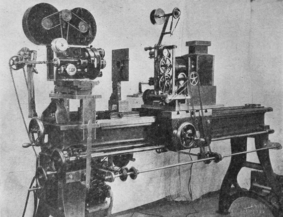
The technology behind the earliest title sequences is fairly simple. Text and other graphical elements were printed or drawn onto a medium of some sort and photographed. In the 1920s, the optical printer was developed, which allowed for much more advanced title graphics, as well as new innovations in editing and special effects. An optical printer is essentially a camera that is connected to one or more projectors, which allows frames to be precisely combined and reordered. Optical printers were used to overlay text onto footage – and, eventually, to create more sophisticated effects, such as split-screen montages.

Sound and Beyond
In the early decades of sound cinema, from the early 1930s to the late 1940s, title sequences continued to evolve, but they did not really transform – they were, by and large, still simply a means of conveying information. That’s not to say that they were unimportant; during this period, directors and designers continued to explore typographical choices and stylistic options.
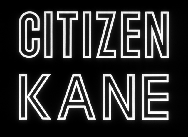
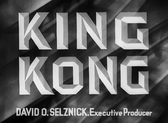
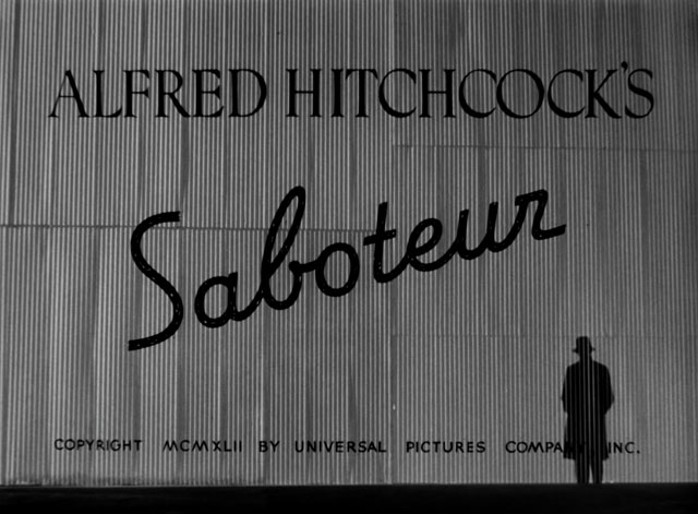
You can find some really interesting examples of genre-specific typography during this period. In the following title graphics (all from films released in 1940), you can probably tell the genre and overall tone of film just by examining the fonts used – even if you aren’t familiar with the specific title.
[gdoc link=”https://docs.google.com/presentation/d/1zy1Eb99f4O01FmAI7n7IgHMg5GzIS7uki3-xLhKd2CU/edit?usp=sharing” size=”large”]
However, it was during the 1950s and 1960s that film titles began to really transform into something new. Dissecting the various reasons behind this shift would be an intensive undertaking – I think that it is sufficient to say that in the early years of cinema’s struggle with television for artistic dominance, a number of brilliant directors and designers collaborated to create some truly remarkable work. These individuals elevated title sequences to works of art that could truly be appreciated independently of the films they introduced. They created miniature films that actively prepared the viewer for the experience that was to come, instead of passively informing them that the feature was about to start.
Saul Bass (1920 – 1996)
The most well-known title designer from the period is undoubtedly the legendary Saul Bass. Bass collaborated frequently with Alfred Hitchcock and Otto Preminger – both famously exacting and eccentric directors. Bass injected incredible creativity into his title sequences, often using abstract geometric shapes that amplified the themes of the films they accompanied. In 1955, when Preminger’s film The Man with the Golden Arm was released, the director had notes sent to projectionists, insisting that the curtains be opened before the titles began. The director clearly felt that the titles were integral to the film and wanted the audience’s full attention.
Pablo Ferro (1935 – 2018)
Cuban designer Pablo Ferro is another tremendously influential figure from this period. Ferro worked on a huge variety of projects over a long career – he animated the first NBC peacock logo, created the hand-drawn titles for Stanley Kubrick’s 1964 film Dr. Strangelove, and worked on typography design for Men in Black. One of Ferro’s most notable sequences was The Thomas Crown Affair in 1968, for which he developed cutting edge split screen effects. Ferro continued to work until his death last year.
Maurice Binder (1918 – 1991)
Maurice Binder was the title designer for an astonishing 14 James Bond films, from Dr. No in 1962 until License to Kill in 1989 (Daniel Kleinman succeeded him for GoldenEye in 1995). During that period, he directed the title sequences for all but two films in the franchise. Highly stylized mini-movies, Bond title sequences have essentially become a sub-genre unto themselves. Binder also created the famous “gun barrel” sequence, in which Bond fires a gun directly into camera and animated blood flows down the screen.
Dan Perri (1945 -)
Dan Perri arrived a bit later on the scene and actually studied under Saul Bass. Perri has been the title designer for a number of hugely influential films with striking title graphics, including Star Wars, The Exorcist, Raging Bull, and A Nightmare on Elm Street. Perri has collaborated frequently with Martin Scorsese, as well as Robert Altman and Christopher Nolan. According to Perri himself, his strength is versatility – he works to give each piece its own identity, rather than his own personal stamp.
Modern Title Design
There is a lot more that we could discuss in terms of the history of title design – the work of designers like Saul Bass and Pablo Ferro could be classes unto themselves. The next major revolution in the world of motion graphics would come with advancing digital technology. Compositing and digital editing allowed for complex sequences to be created more quickly and 3D computer modeling opened up all kinds of possibilities. Eventually, consumer-level software like After Effects allowed title design to become accessible to amateurs and independents, sparking a new wave of creativity.
We’ll dig deeper into the ways digital technology has transformed this field in the weeks to come – and we’ll begin to use that technology to create motion graphics of our own. In the meantime, there are some great resources online about the history of motion graphics. Check out the short documentary THE FILM before THE FILM below, which traces the history of motion graphics in cinema. There are also excellent pieces on Saul Bass, Pablo Ferro, and Dan Perri at Art of the Title.
