Let’s Review
Before we get into the exciting possibilities of 3D compositions, let’s review a few things that have come up while you all worked on the last project.
- Media Encoder vs. Render Queue – There are two main options for exporting a finished composition: the Media Encoder and the Render Queue. The Render Queue is a panel within After Effects (instructions for using it are in Lesson 6) and the Media Encoder is a separate program. In recent versions of After Effects, Adobe has changed which options are available in each – the Media Encoder actually has more options and it uses the same interface as Premiere Pro, so use the same settings. However, it’s possible that your computer won’t have Media Encoder installed and, if this is the case, you’ll have to use the Render Queue. In the Render Queue, under the Output Module, set the Format to QuickTime and the Codec to Apple ProRes LT. The H.264 codec is no longer available in the After Effects Render Queue.

- Composition Settings – Don’t forget to check the settings of the composition you are working in. If you create a composition from a piece of media (such as a still image), that composition will have the same resolution as that media. It’s easy to change the settings of a composition: just go to Composition>Composition Settings… in the top menu or hit Cmd K. Remember to check your composition frame rate and length as well as the resolution. You can always use a preset if you aren’t sure of what to use.
- Title Safe – There’s a little icon at the bottom of the Composition panel that looks like a rectangular crosshairs. This allows you to toggle different overlays such as a grid or title safe markers. Title safe is actually really important: when video is played on a movie or television screen, part of the image may actually be cropped off. Title safe marks the “safe” areas that should definitely be within the viewable area. The outermost rectangle is “action safe” (the outermost area where you should put onscreen action) and the inner rectangle is “title safe” (the outermost area where you should put onscreen text). There may be other lines showing different screen sizes as well. Title safe isn’t as crucial on computer screens and modern televisions, but it’s still a good guide for where you should and should not put text on screen.

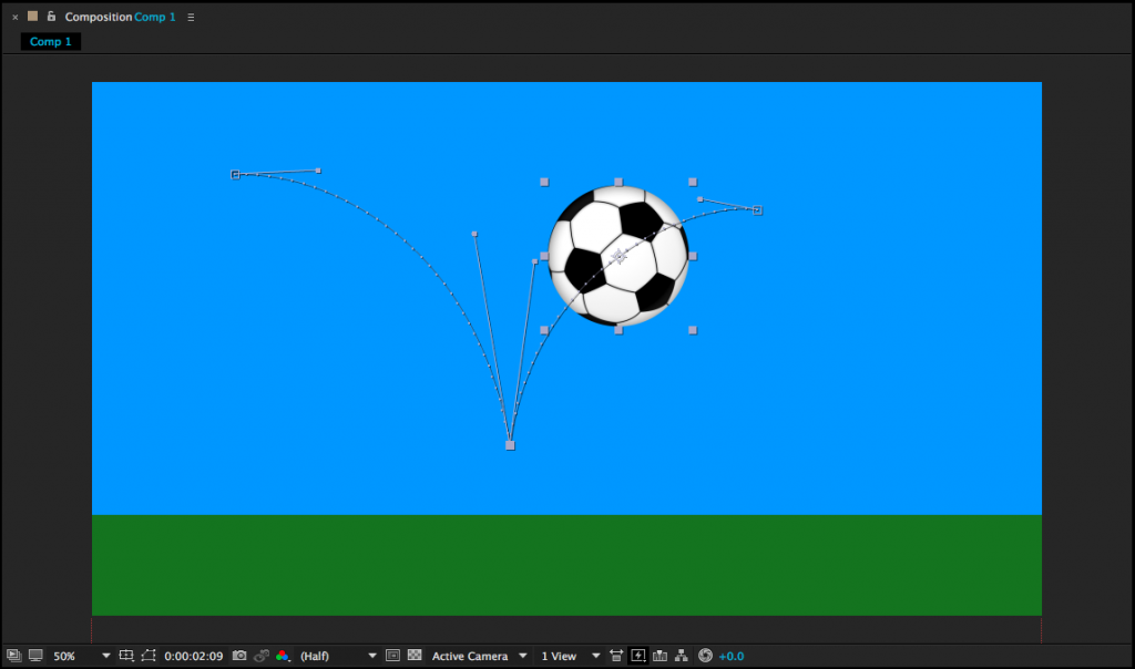
- Keyframe Economy – It’s a common mistake for new animators to add way too many keyframes. Complex animation might require a lot of keyframes, but simple movements do not. Most of the time, a start point and an end point are all you need. You can also manipulate the path of an animated object in the Composition panel. If you highlight a layer, the position keyframes should be visible in the composition window – if you click on one, you have access to little “handles” that allow you to change the way the object moves. Try to keep your keyframe animation as streamlined as possible; the resulting animation will almost always look better for it.

From 2D to 3D
Download the images at this link if you’d like some media to play with.
You may have noticed a series of symbols at the top of the timeline window, next to the Layer Name column. If you can’t see them, toggle the view options at the bottom-left of the timeline window. These symbols represent different properties that can be turned on or off for each layer. For example, the symbol that looks like a strip of film toggles frame interpolation, which is only applicable to video layers. The box we want to use looks like a little wireframe cube. This switches layers from 2D to 3D.

Clicking on this box will probably not make an immediate change to the way your composition looks. However, if you look at the Transform options for that layer in the timeline, you’ll see that the possibilities have expanded greatly.

Position, for example, was formerly defined by two numbers – a value on the X (horizontal) and Y (vertical) axis. In other words, that layer could formerly move up-and-down and side-to-side. With the 3D box checked, a third number has been added – we can now move forwards and backwards on the Z (depth) axis. The anchor point value has also gone from two variables to three. Rotation was previously described by a single number, but now objects can be rotated three ways. There is also a new “Orientation” value, which provides another set of rotation values. Scale has gained a third number as well, although the new Z-scale value won’t generally affect 2D layers.
3D Rotation
Let’s look at the rotation values first. X Rotation spins an object around a horizontal axis, Y Rotation spins around the vertical axis, and Z Rotation spins around the depth axis (2D layers can only spin around the Z axis, so X and Y are the new options). The best way to understand how these work is just to take some time playing with the values. Remember that layers rotate around their anchor points. So, if you want an object to swing open like a door, you’ll need to move the anchor point to the side of the object and keyframe the Y Rotation. If you don’t change the anchor point, the object will spin around its own midpoint.
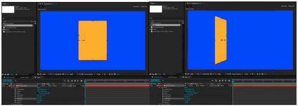
X, Y, and Z Rotation each have their own section under the Transform properties. The Orientation section combines all three into a single keyframe-able value with three numbers. I tend to use the individual Rotation values more than Orientation, but they both do the same thing.
It is possible to work with both 2D and 3D layers in the same composition, but they don’t really “interact” with each other. If you rotate a 3D object so that it intersects with another 3D object, one will be “clipped” by the other. A 2D object will simply float in front of or behind a 3D object, depending on its layer position in the timeline.
3D Position
When you click on a 3D layer, you will probably notice a new icon appear in the composition window. This icon is comprised of a green, red, and blue arrow, centered on the anchor point of the layer. You can click and drag on the green, red, and blue arrows to move an object along the X, Y, and Z axis, respectively. You can also change these values using the three numbers that now appear next to “Position” in the layer’s transform properties in the timeline window.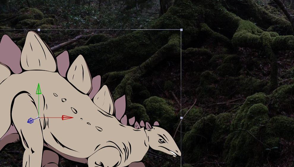
Entering a positive value for the Z position (the third number) will push the layer further away; entering a negative value will pull the layer forward in 3D space. This may be somewhat counter-intuitive, so take some time to familiarize yourself with it. To create a very simple 3D scene, you might enter a positive Z position value for the background layer, a negative Z position value for the foreground layer, and 0.0 for the Z position value of the middle layer. As these layers get moved along the Z axis, their size will appear to change. You can compensate for this by adjusting the scale.
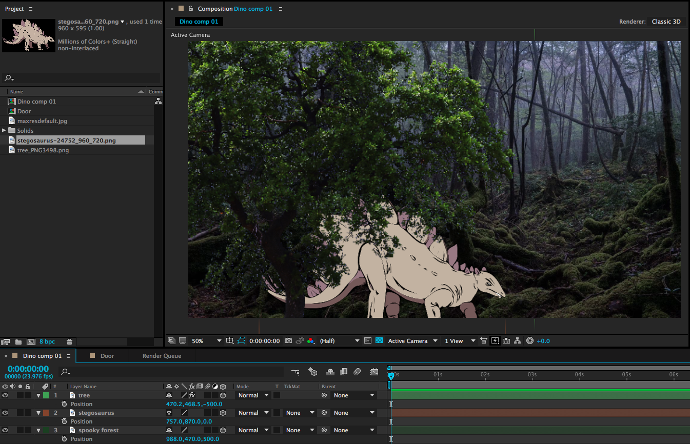
This can give us a nicely layered composition, but so far, we haven’t done anything we couldn’t do by adjusting the scale and position of 2D layers. For example, you can make an object appear to move closer by increasing its scale. So why use 3D position? One reason is that it can be difficult to estimate the way that scale and position should correspond. The other reason has to do with perspective and an effect that we can achieve only by using 3D layers – but for that technique, we’ll need a virtual camera.
A Virtual 3D Space
In our 2D work, we used the After Effects composition window sort of like a collage board; flat layers were placed on top of each other, rearranged, and adjusted. When we switch layers from 2D to 3D, that collage board becomes more like a shadow box; objects can move forward and backward in space. Our perspective on the shadow box hasn’t really changed, though – our view is fixed. By adding a camera to the scene, we can change our perspective and even move into the scene itself, going from a shadow box to a complete virtual environment.
To create a camera, go the the Layer dropdown menu at the top of the screen and choose New>Camera…. This will bring up a dialog box with lots of options. You can dig into these values and customize your virtual camera as much as you like, but I’d recommend leaving most settings at their defaults, at least to get started. The one thing you may want to adjust is the Preset, which has a handful of simulated lens options. These act just like lenses on real cameras: wider lenses (lower numbers) have a larger field of view and Z axis movement will be exaggerated. Longer lenses (higher numbers) have a narrower field of view and Z axis movement will be compressed. If you aren’t sure what to use, either the 35mm or 50mm presets are generally safe, middle-of-the-road options.
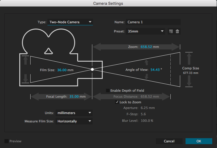
After you create your camera, you may notice an immediate difference in the scale of the objects in your composition. This is because of the aforementioned properties of the lens on your virtual camera. If you tip down the triangle next to the name of your camera layer in the timeline, you will see Transform properties and Camera Options. The Camera Options section contains a ton of variables to play with – you can define the virtual depth-of-field, the shape of the simulated iris, the size of the aperture, and much more.
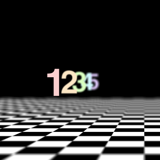
Turning Depth of Field “on” is probably the setting that will give you the most interesting results. Depth of field describes how much of an image is in focus. If a scene has a deep depth of field, lots of things at various distances from the camera will be in focus. If a scene has a shallow depth of field, only a narrow sliver of the scene will be in focus.
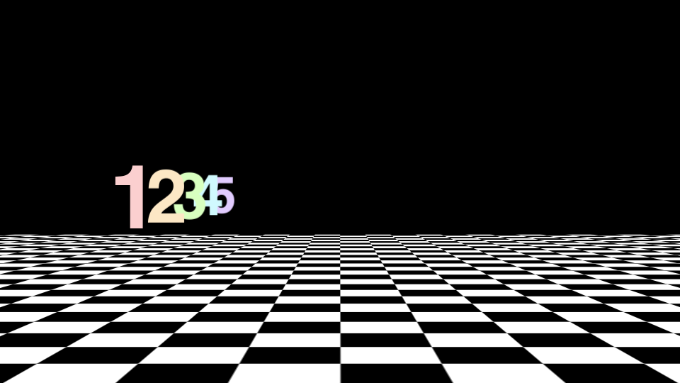

If you have some experience with photography, those basic principles will help you as you define things like focal length and depth of field in the virtual cameras that After Effects uses. For example, you may be aware that a lens with a large aperture produces images with a shallower depth of field than a lens with a small aperture. Increasing the Aperture value in After Effects (which is measured in pixels) will therefore give you a more blurred out background when the Depth of Field toggle is enabled. For reference, the Aperture in the image above is around 400 pixels and the lens is 50mm. If this is unfamiliar to you, you may just have to experiment with the controls a bit to get the results you are looking for.
Moving the Camera
The Transform options control camera movement. You can keyframe the rotation along all three axis, either individually or using the Orientation. The position works the same as other 3D layers, but there is also a keyframe-able Point of Interest property. This is the point that the camera is aimed at; so, for example, if you keyframe the camera’s position along the X axis, but don’t adjust the Point of Interest, the camera will move from one side to the other while remaining aimed at the center of the screen. You can get some cool results this way, so take some time to play around.
In addition to the control options in the timeline window, you can adjust your camera using a section of tools in the toolbar at the top of the screen. The default option is the “Unified Camera Tool” (which looks vaguely like a movie camera), but there are several to try out if you prefer more “hands-on” control.

If you’re having a hard time visualizing how exactly your camera is moving, it can be helpful to change the view setting of your composition window. At the bottom of the window is a dropdown menu that, by default, reads “Active Camera.” Clicking this will give you different options for viewing your composition in 3D space. In particular, Custom Views 1, 2, and 3 are helpful for seeing how your camera is positioned and where it is pointed. Note that you may need to toggle the background visibility on or off (the checkerboard icon next to the view setting) and/or zoom out your view to see what’s going on clearly. Just switch back to “Active Camera” when you’re done.
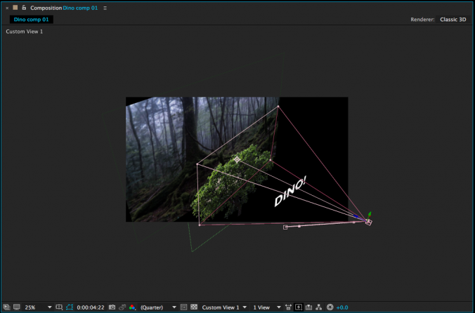
There are many more things to explore when it comes to 3D work in After Effects. You can create different kinds of virtual lights, control the way simulated shadows are cast, affect how shiny or matte objects are, and so on. For now, though, just get used to moving objects in 3D space and operating a virtual camera – it will open up a whole new world of creative possibilities.
