Getting Set Up
This week, we’re going to look at the different methods for creating simple text elements in Premiere Pro. While I prefer programs like After Effects for complex graphics, Premiere is perfectly adequate for many tasks. If you’re creating relatively straightforward, simple graphics, Premiere is a good choice. There are also a number of graphics presets available, if you need to create something quickly.
Download the files at this link and import them into a Premiere project in order to follow along.
A note on different versions of Premiere: Adobe tends to be very strict about having the versions of its files and the versions of its software match. In other words, you can’t open a file created in Premiere 2019 in Premiere 2018. Newer versions can open older files, but not the other way around. There are a few ways of dealing with this, but the easiest is probably this website, which creates a “version agnostic” copy of your file. When you open the file, you’ll be asked to save it under a new name. After that, it should work just fine.
Before we dig in, a quick review: it’s important to use good file management when working in Premiere Pro. Premiere does not make copies of the files you use (video footage, music, still images, etc.) when creating a project. Instead, it remembers where the files are and refers back to them. For that reason, you should always copy your files to a central location before you import them into a project. Make a master folder for your project and put everything you use in there. Save your file to that location as well. That way, you can move your entire project and all of its files just by copying that folder to an external hard drive.
The easiest way to create timeline sequences is by using an existing piece of footage. If you right click on a video clip in your Project panel, you can choose New Sequence From Clip in the menu that appears. This will create a sequence with the same settings (resolution, frame rate, etc.) as that clip. If you want to change any of those settings, you can right click on the sequence in the Project panel and choose Sequence Settings. For your first project in Premiere Pro, I’ve created timeline sequences for you, so you shouldn’t need to change any settings.
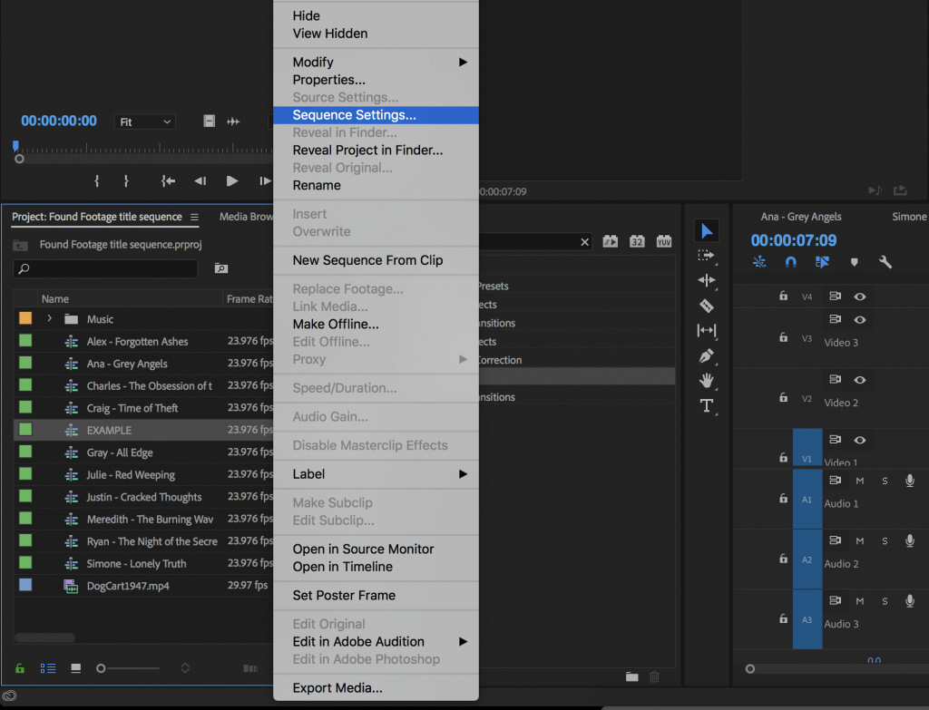
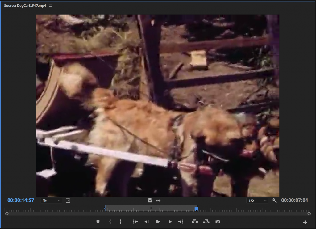
With your sequence set up, you can start bringing clips into the timeline. If you click and drag a clip from the Project window into the timeline, you’ll bring the entire clip’s audio and video into the sequence. If you double click on a clip in the Project window, it will open in the Source Monitor. You can then use the I and O keys to create In and Out points.
You’ll notice a filmstrip icon and an audio waveform icon at the bottom of the Source Monitor – if you click and drag one of these, you’ll bring only the video or audio of the clip into the sequence. If you want to delete either the video or audio of a clip already in the timeline, hold Option and click on either the video or audio layer. You’ll select only the layer you click on (instead of both video and audio), which can then be deleted.
Legacy Titles
Until fairly recently, text in Premiere Pro was handled using a separate window called the Title Editor. This window was accessed by clicking the New Item icon in the Project Window and choosing Title. In the latest versions of the program, however, text is handled using the type tool in the Program Monitor and making adjustments in the Effect Controls panel (or the Essential Graphics workspace). However, the Title Editor is still available and it’s worth looking at.
To find the Title Editor, now called Legacy Title, go to the File section of the top menu and choose New>Legacy Title. Clicking this will bring up options for the title’s name and format, but it will default to whatever the settings are in the currently open sequence. Clicking OK will bring up a new window with options for adding text and shapes. The video in the title window will be whatever the playhead is on in the Timeline. You can choose the text tool, click anywhere on the video, and type in a title. This can be moved and scaled, and fonts can be chosen from the drop-down menu at the top. You can adjust the fill, stroke, opacity, and drop shadow from the Title Properties on the right-hand side of the window. There are also useful alignment tools on the left-hand side, if you want to be sure your text is centered horizontally or vertically.
When your title looks the way you want it to, you can close the window. It’s important to note that titles created in the Legacy Title panel are not added to the sequence automatically – instead, they show up in the Project window. You can drag them into a sequence from there, then adjust their length by grabbing an end with the mouse and pulling them longer or shorter. Be sure to put your title on a track above your video – if it’s below, you won’t be able to see it.
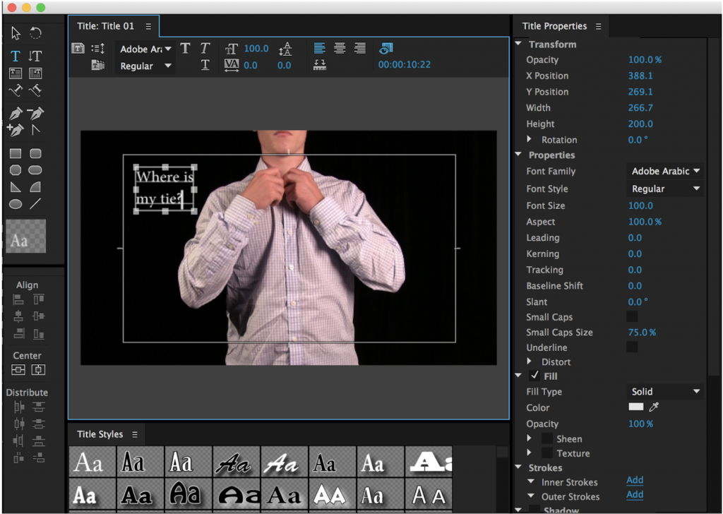
I actually like the Legacy Title panel and I’m a little sad that it is now considered obsolete. It’s a little jumbled and there are many useless options – such as tacky text presets – but it also gives you a ton of customizable options in a single location.
Text Tool and Effect Controls
Most basic text operations can now be handled with the Type Tool and the Effect Controls panel. You can choose the Type Tool from the tool bar, click anywhere in the Program Monitor, and start typing some new text in that location. You can also draw a box with the Type Tool in the Program Monitor to create a defined text area. When you do so, the text will appear in your active sequence as a new graphic element, rather than showing up as a new piece of media in the Project panel.
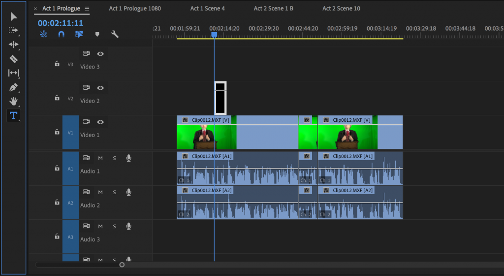
Using the arrow tool, text in the Program Monitor can be moved, scaled, and rotated. For more advanced options, you’ll need to highlight the text graphic in the Timeline and go into the Effect Controls panel. This is where you’ll find many of the options that were present in the old Legacy Titles window. You can change the font, size, color, and justification, as well as add a drop shadow or stroke. If you are having difficulty modifying the text, use the arrow tool to click on it directly in the Program Monitor.
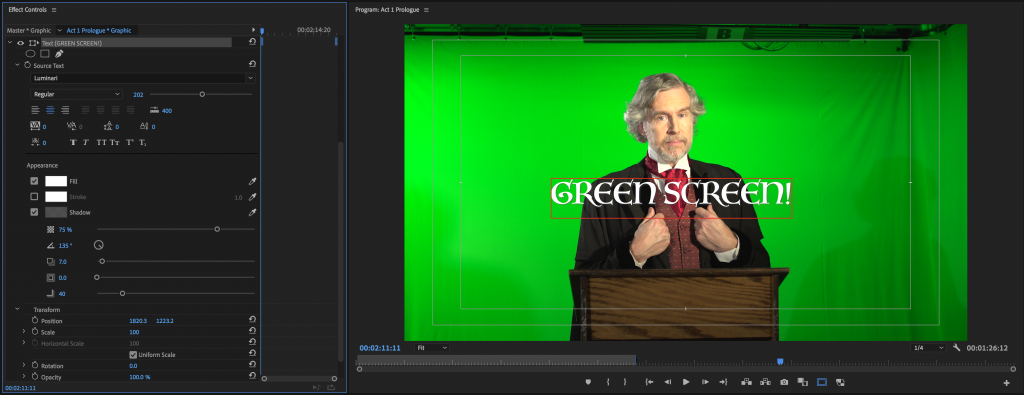
Many of the properties in the Effect Controls can be keyframed and animated – you could keyframe the text’s position or opacity, for example, to create a simple animated graphic. For more advanced controls, however, you’ll need to use the Essential Graphics panel.
Graphics Workspace
Many of the features present in the old Legacy Titles panel are not available in the Effect Controls. For example, there is no way to create a simple shape and there are no quick options for centering the text. For these features, you’ll need to access the Essential Graphics panel. Essential Graphics is most easily accessed by switching to the Graphics workspace, using the list at the top of the Premiere workspace. The panel can also be found using the Window dropdown from the top menu.
Essential Graphics is comprised of two sections: Browse and Edit. The Browse section contains a number of presets for text-based graphics. If you want to add a relatively simple, polished text element to your video, these are a fine option. Many of these presets also incorporate some animation, such as sliding in or fading out.
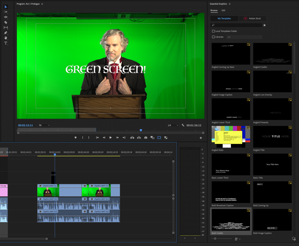
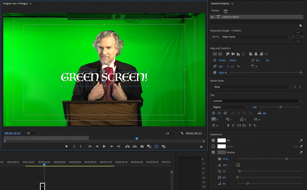
The Edit section of Essential Graphics is where you can really customize your text. Many of the options from the Effect Controls panel are repeated here, but there are some additional features. One of the most useful is the Align and Transform section, which contains a number of icons that can either center a graphical element or align it to a side of the frame – with a single click.
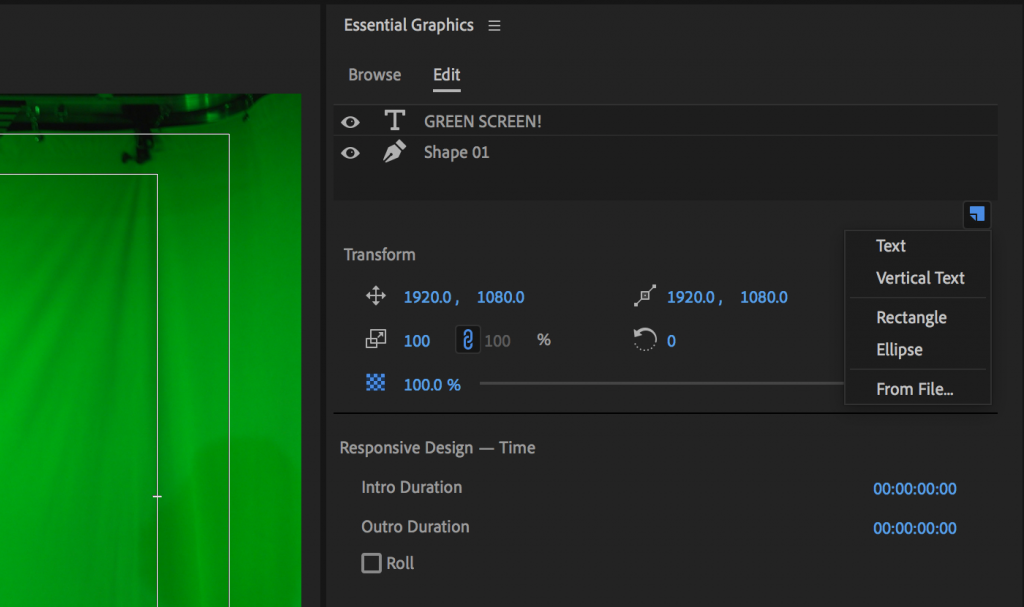
You can actually have multiple elements in a single graphic: text layers, shapes, still images, etc.. Simply click on the small New Item icon – it’s a little square with a turned-up corner – to add a new layer. There are options of horizontal and vertical text, rectangles and ovals, and a “From File…” option that lets you import a file. These all become part of the same graphic element and you can change the order in which these layers are stacked by rearranging them in the top section of the panel.
One last interesting area to look at is the Responsive Design section that appears below the list of layers. Responsive Design allows you to automatically adjust certain parameters, such as position, based on other factors, such as the position of another layer. For example, if you create a text layer and a rectangle, you can “pin” the position of the text to the rectangle by selecting the rectangle layer in the dropdown menu and clicking on the crosshairs icon. Moving the rectangle will then cause the text to move with it.
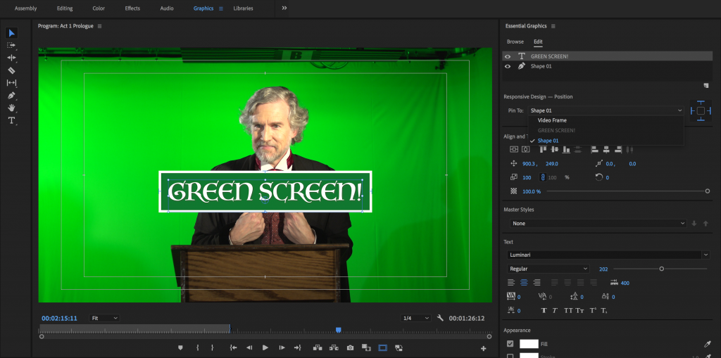
If you decide to start with a preset graphic (from the Browse section), you can also customize the parameters in the Edit panel. Clicking on text will allow you to adjust the font options, while clicking on the graphic in the timeline will let you change things like the overall position and opacity. You can also (usually) customize the length of a preset graphic’s intro and outro animation, under Responsive Design – Time.
If you want to make more precise changes to a graphic’s animation properties, check the Effect Controls panel.

